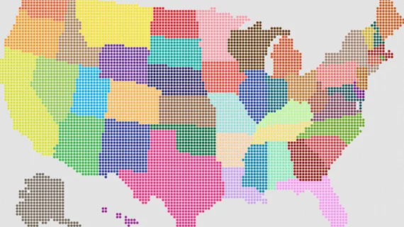
3 online COVID trackers to bookmark now and check whenever
This week NPR has posted three interactive infographics that health execs may find especially valuable as COVID-19 surges in spots across the U.S. and around the world.
Part of the broadcaster’s “Coronavirus by the Numbers” series, the new items are regularly updated and worth a daily or weekly look:
1. U.S. map showing where counties stand on hospital capacity
2. World map with country-by-country counts of new cases, new cases per 100,000 residents, total cases and total cases per 100,000
3. Heat map indicating COVID risk level by four color-coded categories
NPR started the series in the spring and has archived it as an ongoing collection.

